
Utilization and functionality are both integral elements to indicate the success or failure of a web design. From simple-to-complex user interface, each click of a mouse, every tap of a finger, or pinching a screen to zoom in a page, user-centric principles must be a top-of-mind priority for designers and web developers alike.
In this blog, we will discuss the different website design principles that business owners should know to create a successful website that attracts visitors and converts leads.
Principles of A Good Website Design
Focus on Users’ Attention
According to research, the average human attention span is now shorter than a goldfish’s. It is reported that goldfish have a 9-second attention span; while humans at 8.25 seconds.
When planning to launch a website of your own, or perhaps, giving a fresher look, make sure to manage an 8.25-second span of attention. How? By using the right style on typography, color schemes, visual techniques, functionalities, signals and removing all unnecessary communication barriers.
Managing one’s attention on your own website is like presenting your business face-to-face with prospective clients or customers. You are standing in front of a crowd, verbally communicating your USPs (Unique Selling Points) and brand value. Hence, catching those eyeballs and listening ears to maintain your composure and relevance.
But wait, there’s more! (Change of tone)
Pause…
Then, continue holding everyone’s attention.
2-to-3 Click Method
Patience is always a great virtue. But not all online users have the patience to keep searching for the product, service or information that they need. Keep in mind that every user requirement project must be kept at a minimum.
Simplicity is key. Simple terms, simple process, simple flow. Complexity of user flow reaches a serious dead end. So, if you happen to have an existing website that requires a long form to fill out, or requests a user to jump from a single page to multiple screens, think again.
Design with the user in mind. Make sure your website is easy to navigate, intuitive, and provides a positive user experience on various devices and screen sizes.
Ask yourself, “How can I eliminate steps that are not helping my target audience?”
Don’t Let Them Think (Too Much)
Similar to the above analogy, making things simple is key. Effective writing and user-friendly navigation should both come handy.
Lead your audience to the right and proper directions through the use of catchy and easy-to-understand headlines, body texts, menus, and all relevant website functions. Make use of proper color schemes and combinations that are not visually comprehensive.
When a gallery of images are available on your web page, will the users instantly know how to browse your library with ease? Otherwise, think again.
Breathing Space
We’ve asked our Web Developer, Nikko Tomas, about his personal practice when designing a website. He said,
“Story-telling matters. This can be balanced with content and visual techniques when narrating a story.”
Nikko also shared that white space gives more breathing and clarity when User Experience (UX) becomes a priority.
Avoid clutter and complexity. Use a clean layout that guides users’ eyes to key information, making it easy for them to understand your offerings.
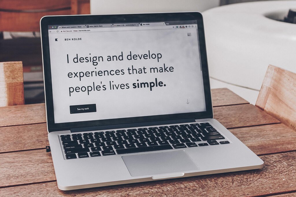
Use Compelling and High-Quality Images
The images on your website are often the first thing visitors notice. High-quality images instantly create a positive impression of your brand, professionalism, and attention to detail. You want to make sure that the images are visually appealing to capture the viewer’s attention and make the website more engaging.
The quality of the image also matters because low-quality or pixelated photos can give the impression of a lack of professionalism and attention to detail. High-quality images, on the other hand, convey that you care about the quality of your online presence.
Just because you can pay for generic stock photos doesn’t mean you should. If you want your website to stand out, use original, high-resolution images and graphics that align with your brand and enhance your content.
You can use real photos relevant to your organization such as your products, workspace, events, leaders, and even your employees.
Reimagining a modern design studio allows us to revive a truly customer-and-people-centric approach, in respect of how our clients do business, ‘The Studio Bridge’ unlocks quality, cost-effectiveness and reliability.
Beyond copywriting, sitemaps, menu naming, wireframes and navigation features, website designs must be balanced with white spaces, simple structures, visual hierarchy and user-centricity.
We hope that you’ve learned a few lessons from this blog. Stay tuned for more industry-related and value-adding content on our blog and our social media pages. ‘Till next time!
Learn more about ‘The Studio Bridge’ expertise today.
For inquiries on our services or to request a quote, send us a message on our Contacts Us page.
About The Author

Freddie Lacorte
He's the Brand Architect "slash" Digital Trailblazer of the Team. Freddie brings forth his expertise in Marketing, getting the word out there about us. Whether it's establishing one's identity with branding solutions, or tapping onto the latest digital trends, he got those covered. On the side, he's a frustrated singer who plays acoustic guitar.
View Freddie’s LinkedIn Profile here.