Shattering myths and misconceptions about utilizing white space arise in the field of design. There are common misconceptions when we talk about negative space: To some, white space is a wasted space; cramming more content is better; or achieving white space is easy.
By understanding the common misconceptions, you can truly appreciate the importance and implications of negative space (also known as white space).
Here are some tips on effectively using negative space in design:
1. Practice Simplicity
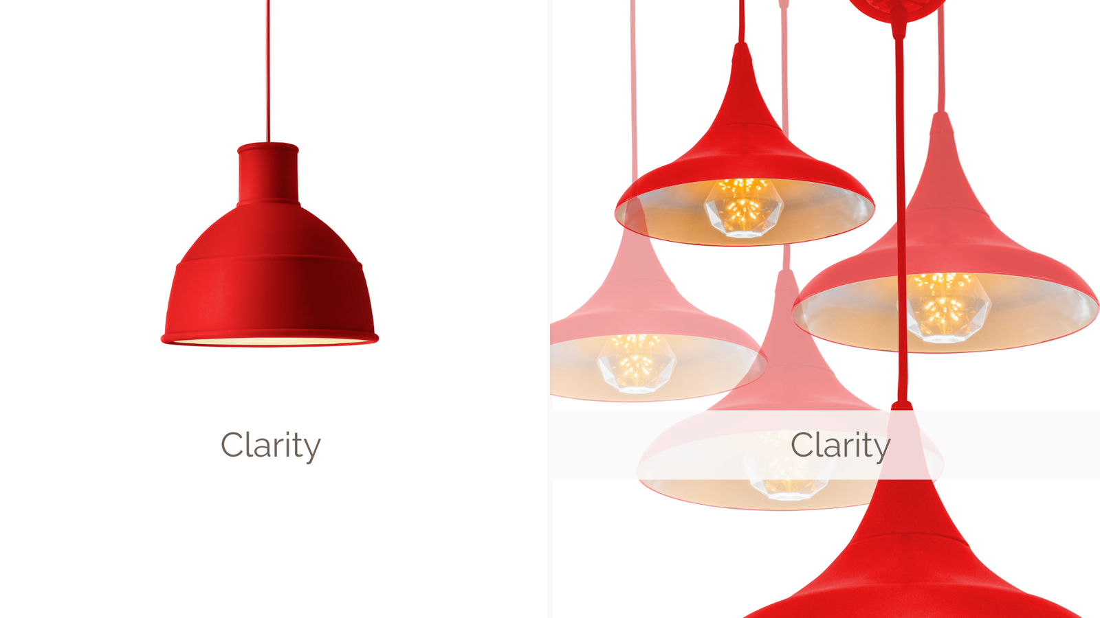
Usage of negative space allows design elements to breathe and gives a clean, uncluttered impact. Practicing simplicity, by strategically leaving areas empty, giving your design a sense of sophistication and neatness.
2. Establish Visual Hierarchy
Negative space helps boost visual hierarchy by directing the viewer’s attention to the most important elements. Use negative space to create contrast and emphasize key information or focal points in your design.
3. Improve Readability
Avoid overcrowding and allow sufficient spacing between lines, paragraphs, and elements, making it easier for users to absorb desired information. Ample negative space around text and other content elements enhances readability.
4. Convey Meaning
Negative space can be used creatively to convey symbolism, emotion, or hidden messages within a design. Play with the shapes formed by negative space to add depth, intrigue, or reinforce the concept you want to communicate.
5. Achieve Visual Balance
Balance and harmony in your design can be achieved through negative space. Distribute elements evenly and prevent the design from turning out as overwhelming.
6. Guide the Eye
Related to improving readability, you can leverage negative space to guide the viewer’s eye through the design. It can act as visual pathways, leading the viewer’s gaze to important elements like calls to action and other key sections.
7. Shape Recognition
Negative space can help define and highlight shapes and forms within a design. Pay attention to the interplay between positive (filled) and negative (empty) space, using it to create recognizable and memorable shapes that reinforce your design’s message.
8. Improve User Experience
Negative space affects user experience (UX). Sufficient spacing between interactive elements, such as buttons or links, reduces the chances of accidental clicks or touch errors, improving usability and overall satisfaction.
Now, we’ve listed down those design hacks to effectively use negative space in your design. With these tips, you can create compelling and harmonious visuals to capture eyeballs and engage your audience.
Drawing out the big idea to produce enticing, mind-blowing, and innovative materials that grab consumers’ attention is what makes The Studio Bridge any marketer’s dream partner. Learn more about our Design services here. For consultation or to get a quote, simply Contact Us today.